I came across a tweet about the potential price of Ergo five years from now when the mining block rewards are gradually reduced from 66 to 3:
I don't know who needs to hear this:
— Chris Ray (@Haskell_plus) March 13, 2022
Currently block reward for #Ergo miners is 66 $ERG per block mined, that is approx. \(154,440 a day<br>In about 5 years block reward will be 3 <a href="https://twitter.com/search?q=%24ERG&src=ctag&ref_src=twsrc%5Etfw">\)ERG per block mined, to maintain \(154,440 a day in rewards that brings the price of <a href="https://twitter.com/search?q=%24ERG&src=ctag&ref_src=twsrc%5Etfw">\)ERG to $71.5 🐂
The author suggests that the price of Ergo will more than 20x within the decade if nothing else changes.
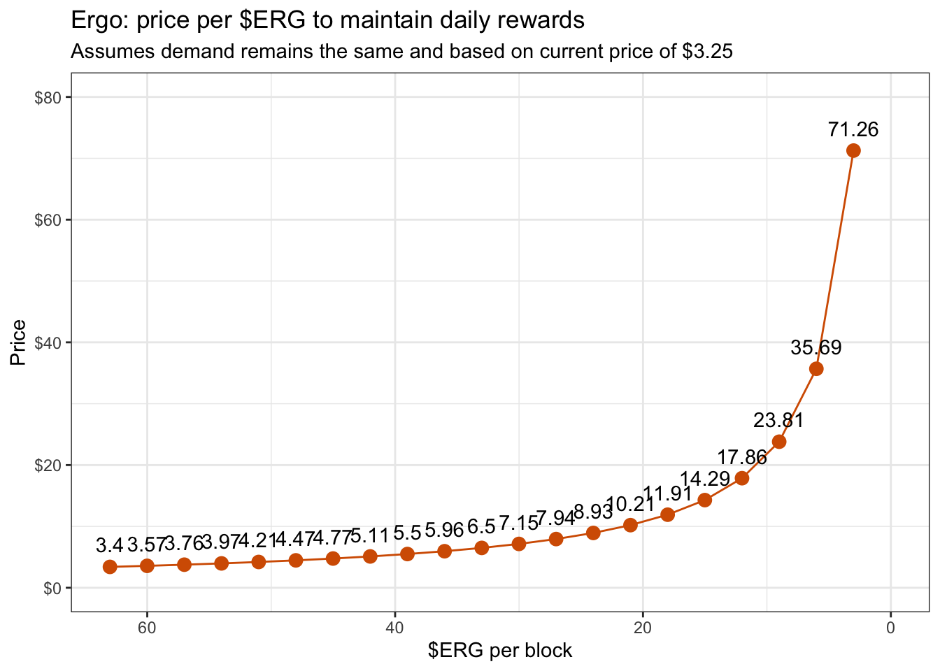
Although interesting, I find it even more fascinating to visualize how that price curve would look over time with each phase of the reduction in block rewards.
Below is the R code I used to generate the graph in response to that tweet.
There were some Discord discussions about your tweet so thought this visualization would help others understand what that price curve would look like if nothing changed :) #ergo #ergonauts $erg pic.twitter.com/f5k30qiLRY
— Christopher Yee (@Eeysirhc) March 16, 2022
Load packages
library(tidyverse)
library(scales)
Define function
The 154440 is derived from total blocks mined for the day in USD value priced at $3.25. Ergo’s average block time is 2 minutes so we get 30 blocks per hour and multiply that by 24 hours in a day.
ergo <- function(ergo_blocks){

  df = 154440 / (ergo_blocks * 30 * 24)

  return(df)
}

df <- seq(0.01, 66, 3) %>%
  as_tibble()
Note: we start with 0.01 as an offset for multiplying values by 0.
Visualize data
df %>%
  mutate(price = ergo(value)) %>%
  ggplot(aes(value, price)) +
  geom_line(size = 0.5, color = '#D55E00') +
  geom_point(size = 3, color = '#D55E00') +
  geom_text(aes(label = round(price ,2)),
            hjust = 0.5, vjust = -1) +
  scale_x_reverse() +
  scale_y_continuous(limits = c(0, 80),
                     labels = dollar_format()) +
  labs(x = "$ERG per block",
       y = "Price",
       title = "Ergo: price per $ERG to maintain daily rewards",
       subtitle = "Assumes demand remains the same and based on current price of $3.25") +
  theme_bw()
From the graph above, we can speculate the price of Ergo would see a linear increase over time with a sharp parabolic rise at the end within five years when block rewards are reduced down to 3 from 66.
Wrapping up
It should go without saying that change is the only constant here so we can’t accurately predict what the price will be in the future let alone tomorrow. However, by visualizing that price curve from current market conditions and assuming all else remains equal, we get a decent idea of what it could potentially look like and manage our expectations accordingly.
If you found this remotely helpful or entertaining then don’t hesitate to drop some cryptocurrencies into my cryptojar.
:)